Amazon is one of the largest and most influential tech companies globally. With its vast reach, it is essential for the company to maintain a strong visual identity across various platforms, from e-commerce websites to mobile apps and even voice-based services like Alexa.
One of the key elements of Amazon’s branding is its typography, which helps create a consistent and easy-to-read experience for users. In this article, we’ll explore the fonts Amazon uses across its platforms and the role they play in the company’s branding and user experience.
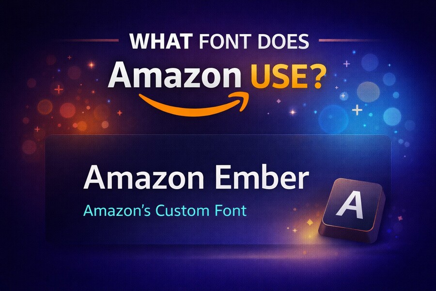
Amazon’s Primary Font: Amazon Ember
Amazon’s primary typeface is Amazon Ember, a custom font designed specifically for Amazon’s brand. This font is used across all of Amazon’s platforms, from its website to its mobile app and Alexa devices. The font was developed to ensure maximum legibility across different screen sizes and resolutions, making it a versatile choice for both digital and print materials.
Amazon Ember is known for its clean, modern look. It includes several weights, from light to bold, which allows designers to create a visual hierarchy that guides the user’s eye through text-heavy pages. The font also supports multiple languages, making it a key component in Amazon’s global branding strategy. If you want to understand how this font enhances readability and user experience, you can use a free blank text generator to experiment with different typesetting.
The Role of Typography in Amazon’s User Interface
Typography in Amazon’s interface is designed not only for aesthetic appeal but also for function. In a fast-paced e-commerce environment, the goal is to provide users with a seamless, frictionless experience. The typeface plays a significant role in achieving this by making information easy to digest. By using Amazon Ember, Amazon ensures that its text is legible and pleasant to read, even on small screens.
For instance, on Amazon’s product pages, the title of the product is typically displayed in a bold weight, drawing attention to it immediately. The product description, on the other hand, uses a lighter weight to prevent the page from feeling too heavy. The careful use of different weights and sizes helps the company guide the user’s attention to key information without overwhelming them. Additionally, the font’s simplicity ensures a professional look that reinforces Amazon’s brand identity.
Secondary Fonts: Bookerly and Kindle Fonts
In addition to Amazon Ember, Amazon also uses Bookerly as its secondary typeface, especially on Kindle devices and apps. Bookerly was developed specifically for Kindle to improve readability and provide an optimal reading experience for e-books. This font is highly legible and designed for long-form reading, making it ideal for the Kindle ecosystem.
Bookerly’s letterforms are soft and rounded, designed to feel like traditional printed books while still maintaining the benefits of digital fonts. It ensures that users can read for long periods without experiencing strain. Unlike Amazon Ember, which is used for interfaces and websites, Bookerly is tailored to an immersive reading experience. If you’re a Kindle user, you’ve likely seen this font in action, providing a smooth and enjoyable reading experience.
How Typography Affects Amazon’s Branding
Amazon’s typography is a crucial part of its branding. The choice of fonts reflects the company’s values of simplicity, efficiency, and professionalism. Amazon Ember, with its clean and modern look, aligns with the company’s commitment to providing a seamless experience across all platforms. Whether you’re browsing on a desktop, using a mobile app, or interacting with an Alexa device, Amazon’s typography creates a cohesive and recognizable identity.
Typography also plays a role in user trust. A clear and readable font can make users feel more confident about navigating a website or interacting with a service. By choosing fonts that prioritize legibility, Amazon ensures that users can easily read product descriptions, customer reviews, and other critical information. This contributes to a positive user experience and helps foster brand loyalty.
The Impact of Typography on Amazon’s User Experience
Amazon’s attention to typography has a direct impact on its user experience. The readability of text affects how users perceive the website’s usability. If text is difficult to read, users may feel frustrated and leave the site, potentially causing a drop in sales. Therefore, ensuring that the font is legible and easy to read is essential for maintaining a positive user experience.
With its simple, streamlined fonts like Amazon Ember, Amazon creates a user-friendly environment where visitors can easily find what they’re looking for. Whether users are reading reviews or scanning through product details, the typography contributes to a smoother navigation experience. The consistency of typography across devices further enhances the usability of Amazon’s interface.
Amazon’s Font Choices for Accessibility
Amazon also takes accessibility into account when choosing its fonts. Amazon Ember is designed to be highly legible, even for users with visual impairments. The font’s clean lines and wide spacing make it easier for screen readers to interpret text, and the use of varying weights allows for clear differentiation between headings and body text.
Additionally, Amazon provides options for users to adjust text size and contrast, further enhancing accessibility. By prioritizing readability and accessibility, Amazon ensures that its content is accessible to a wider audience, which is particularly important given its global reach. Whether you’re using Amazon in English or another language, the fonts are designed to maintain high legibility across different scripts and alphabets.
How to Use Amazon’s Font in Your Own Branding
While Amazon’s fonts are proprietary, there are ways to incorporate similar typography styles into your own brand. For example, you can use fonts that are inspired by Amazon Ember for your website’s user interface or marketing materials. Many font libraries offer fonts with similar characteristics—clean, modern, and highly legible—that can give your brand a similar professional look.
If you’re building a website or a product, using a font like Bookerly for long-form content can help improve the reading experience, just as Amazon has done with its Kindle devices. Using a font that prioritizes readability is essential for creating a seamless user experience that keeps your customers engaged.
Conclusion
Amazon’s typography, including Amazon Ember and Bookerly, plays a pivotal role in shaping the company’s brand identity and user experience. These fonts are designed to ensure readability, accessibility, and a cohesive visual identity across all of Amazon’s platforms. Whether you’re shopping on Amazon’s website or reading an e-book on a Kindle, the typography is an integral part of the experience. By understanding the importance of typography in branding, you can apply similar principles to your own designs to create a more professional, user-friendly experience.
By focusing on font selection and its impact on user experience, Amazon has set the standard for typography in the tech industry. You can adopt similar strategies in your design to create an interface that is as intuitive and accessible as Amazon’s. Whether you’re developing a website or an app, keep in mind that the right font can greatly influence the usability and perception of your product.