Memes have become an integral part of internet culture, often conveying humor, satire, and social commentary. One of the key elements that make memes instantly recognizable is the font used in their creation. Understanding which fonts work best for memes can help you make more engaging and visually striking content. Whether you’re creating memes for personal use or trying to go viral, knowing how to use fonts effectively is crucial.
In this article, we will explore the best fonts for memes, how they affect meme readability, and why certain fonts are used more than others. Read on to learn how fonts like Impact and Comic Sans have become iconic in the meme world and how you can use them to create your own viral content.
The Impact of Font on Meme Culture
Fonts are not just a design choice for memes; they shape the way a meme is received and understood. The Impact font is arguably the most iconic font associated with memes. This bold and condensed typeface ensures that text stands out even against busy images. It is widely used for meme captions, especially those that require a quick punchline or dramatic effect. The popularity of Impact can be attributed to its simplicity and high visibility.
Other fonts like Comic Sans and Arial Black are also popular in meme creation. These fonts are chosen for their clarity and boldness, making them ideal for capturing attention quickly. The key to choosing the right font is ensuring that it fits the tone and message of your meme. Whether you’re going for humor, irony, or sarcasm, your font should complement the image and enhance the overall effect.
If you’re looking for a free blank text generator to help you experiment with different fonts and text styles for memes, you can consider the blank texts generator.
Why Impact Is the Most Common Meme Font
The Impact font has been a staple in meme culture for years. Its bold and condensed design makes it highly legible, even on busy or complex backgrounds. The simplicity of the Impact font allows it to stand out against almost any image, ensuring that your meme’s text is easy to read at a glance. This font’s widespread use can be traced back to early internet memes, where it became the go-to choice for creating simple, impactful memes.
The popularity of Impact also stems from its association with humor and exaggeration. The dramatic effect of bold text against an image adds to the humor, making it the perfect choice for memes that require a bold statement. Its versatility allows it to be used for a wide range of memes, from sarcastic humor to motivational quotes. When you’re creating memes, using a familiar font like Impact can help your content resonate with audiences who associate the font with internet humor.
Exploring Other Meme Fonts
While Impact is the most recognizable meme font, there are several other fonts that can work well depending on the style and tone of your meme. Fonts like Arial Black, Bebas Neue, and Anton are also used frequently in meme design. These fonts share some similarities with Impact, such as boldness and legibility, but they each bring their own unique flair to the table.
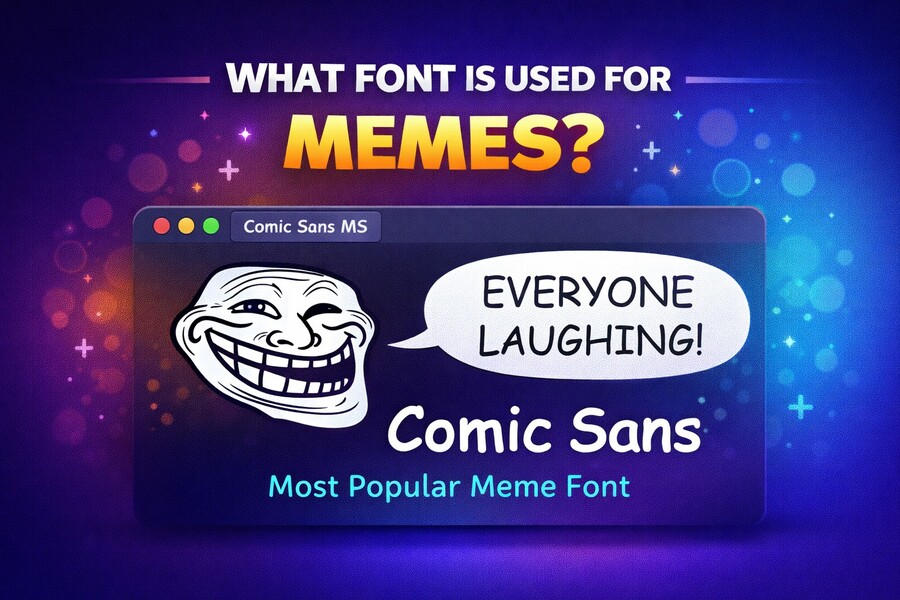
For memes that require a more casual or playful vibe, Comic Sans is a popular choice. Despite its often mocked reputation, Comic Sans is a favorite for memes that aim to add humor through its childish and informal appearance. The font is often used for memes that play on absurdity or irony, making it an excellent choice for certain types of meme content.
Typography Elements to Enhance Meme Readability
Choosing the right font is only one aspect of creating effective memes. The way you position and style your text also plays a significant role in its readability and impact. Adding text outlines or shadows is a common technique used to ensure that text stands out, even when placed on busy or complex images. A white text with a thin black outline is the classic styling for most memes, as it helps to improve visibility without overpowering the image.
Other design techniques, such as adjusting text size or adding spacing between characters, can further enhance the legibility of your meme. The goal is to ensure that your text is easily readable while still complementing the image and tone of the meme. Text placement is also critical; text should not obstruct key elements of the image, but it should still be prominent enough to draw attention.
For more tips on text placement and meme design, you can check out how to add spaces in Instagram captions for a more organized text presentation by visiting how to add spaces in Instagram captions on iPhone.
The Role of Font in Meme Virality
The choice of font plays a crucial role in how viral a meme can become. Memes that use bold and clear fonts are more likely to be shared, as they are easy to read and quickly convey their message. The Impact font, for instance, has become synonymous with internet humor, making it highly recognizable and sharable. People are more likely to engage with a meme that is easily readable and instantly understood.
Fonts also contribute to the emotional tone of the meme. A bold, dramatic font like Impact can intensify the humor or message of the meme, while a font like Comic Sans can add an ironic or whimsical touch. Choosing the right font is essential for ensuring that your meme resonates with your target audience, and using fonts that are associated with internet culture can help boost your meme’s popularity.
If you’re looking for more meme-related tips, you can learn how to send a blank message on Instagram, which can help you in crafting visually appealing memes. Tips like how to send a blank message on Instagram can prove helpful.
How to Choose the Right Font for Your Meme
When creating a meme, it’s important to choose a font that aligns with the message and tone you want to convey. Impact is a safe and reliable choice for most memes, but depending on the type of humor or message, you may want to experiment with other fonts. For instance, a meme that aims to be ironic or humorous might benefit from the playful nature of Comic Sans, while a meme with a serious or dramatic message might be better suited to a bolder font like Bebas Neue.
Consider the audience you’re trying to reach and the type of meme you want to create. Fonts like Arial Black and Montserrat can work well for memes that need to be clear and straightforward. On the other hand, if you’re aiming for a more casual or humorous tone, fonts like Comic Sans or Dancing Script can help create the desired effect.
For more helpful insights into how to make memes with blank text, learn how to type blank text.
Conclusion
Choosing the right font for memes is more than just a design decision; it’s about aligning your text with the tone, humor, and message of the image. Fonts like Impact, Comic Sans, and Arial Black are staples in meme culture, each bringing its own unique flair to meme creation. By understanding the impact of font choice on readability and tone, you can create memes that resonate with your audience and have a higher chance of going viral.
Remember to consider the overall style and context of the meme when selecting a font. Text placement, color, and styling are equally important in ensuring that your meme stands out. Armed with this knowledge, you’ll be able to create compelling, shareable content that connects with your audience.